From the Archive: Andreas Scheiger — ‘S is for Spine’ (CAROUSEL 31)
In his most recently published studies, Austrian designer Andreas Scheiger has made some startling discoveries in The Evolution of Type.
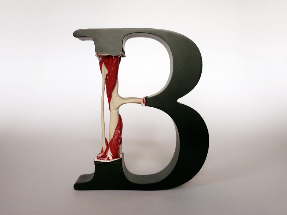
By dissecting and documenting the taxonomic ranks of the English alphabet he has not only proven that letters are living organisms and that typefaces are species, but also that B is in fact for Bone (see Exhibit 9) and M can be for both Muscle and Marrow (see Exhibit 14).
Inspired by the book, The Alphabet and Elements of Lettering (1918), by the pioneering American type designer Frederic W. Goudy (the creator of Goudy Old Style and Copperplate Gothic), Scheiger began conducting his own research, compiling a collection of exhibits and figures that further explore the organic nature of alphabetic communication. Letters and the words that they create share a common descent and are ever evolving.
With his reputation as a graphic designer, illustrator and artist already established, Scheiger directed his attention to proving the evolution of type as a fact. Celebrating the science and graphic design of the Victorian era, Scheiger’s work strives to simplify an intricate concept like evolution with its ornate complexity. Typefaces themselves are a record of man’s history and development. Even without forming words, letters tell stories. They naturally shift and adapt. All written communication shares a lineage to a single marking on a cave wall.
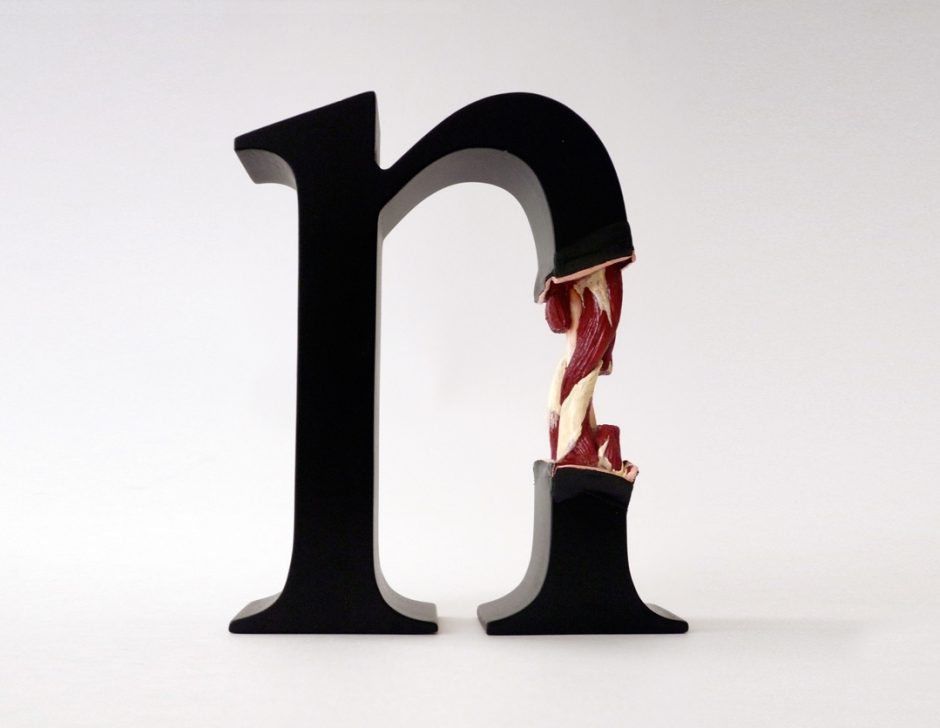
In his Graphic Laboratory, Scheiger has been able to incise and retract the flesh of several consonants and vowels, exposing the veins, bones and muscles within. Performing a process seemingly similar to the
plastination process (invented by Body Worlds’ Dr. Gunther von Hagens), the systems and structures of consenting capital letters have been preserved. The inner workings of each letter have been painstakingly contrived and sculpted from wood, powder-coated MDF, polymer clay, wire, shells, corals and carved chicken bones.
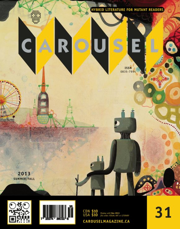
With the aid of photographer Susanne Stemmer, a number of surgical procedures and autopsies have been recorded, capturing language being broken down to its bare mechanics with scalpels and forceps. Beneath the dried-ink surface, the anatomy of the letters is strikingly similar to those of mammals. The integuments and tissues share a common construction and design (see Exhibit 4). Even some bone formations have a common arrangement. The downward stroke of the letter B contains a radius and an ulna much like a forearm (see Exhibit 9), and the front leg of a lowercase N appears to share some resemblance with a developing shin (see Exhibit 12).
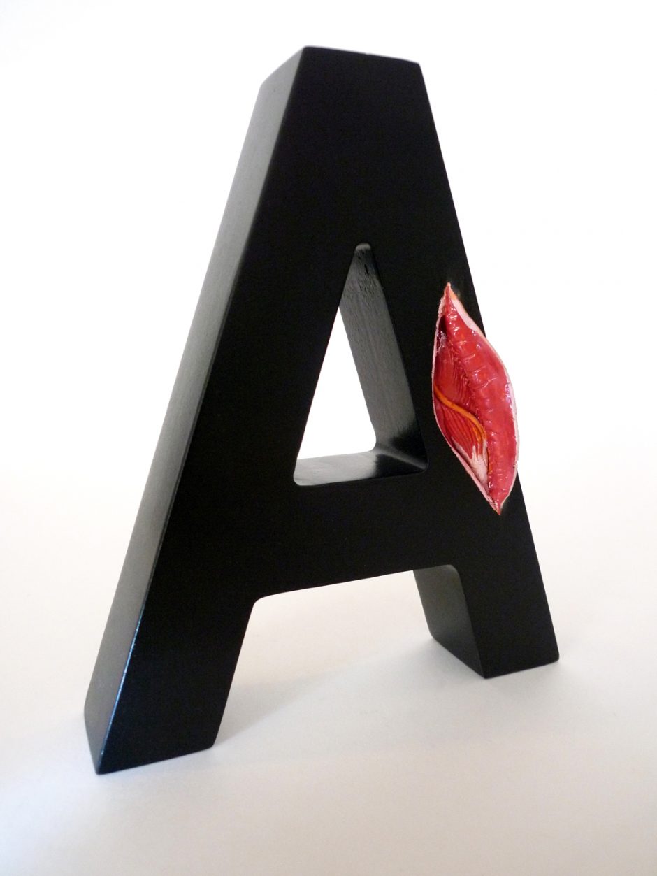
In his defense of The Evolution of Type, Scheiger has gathered a compilation of samples and drafted instructional anatomical typography diagrams (see Figure 23) of the clinical dissections. In one glass case stand three Es of the same serif typeface. Each one depicting a different biological layer: the first one is pure muscle, the second is all veins and arteries, and the third is nearly whole except where the casing has been removed and the muscles and veins are visible (see Exhibit 10). In another display case lays a Q, splayed like a Rorschach-butterfly of meat and vertebrae (see Exhibit 20), an inkblot sliced in two. The blast of an exploded G has been contained in a bell jar (see Exhibit 11). Two pieces radiating away from the spine at the top of its arch.
By revealing the complex circulatory systems and skeletal musculatures, researchers can examine the ballistic movements and flexibility of a variety of letters, particularly those that are often inert or empty. As written communication has evolved from hieroglyphs to idioms, alphabets have silently adapted to the languages and customs of the different regions around them. Letterforms themselves seem to change like fashion.
Like an entomologist, Scheiger has collected fifty-nine varieties of fonts and sizes of the letter M (see Exhibit 14). Each delicate, balsa wood M has been carefully pinned and mounted behind the glass lid of an old wooden showcase. Each specimen has been labelled and catalogued, categorized by its Latin typeface classification. Arranged by point size, weight and slope, the selection presents the diverse heritable traits shared amongst a generation of serifs. Positioned together the evolutionary nature of typographic characters becomes more apparent. Like Darwin’s finches, the species of Scheiger’s Ms seem to have evolved from a single ancestor, but each one has had different selective pressures applied, resulting in their differing traits.
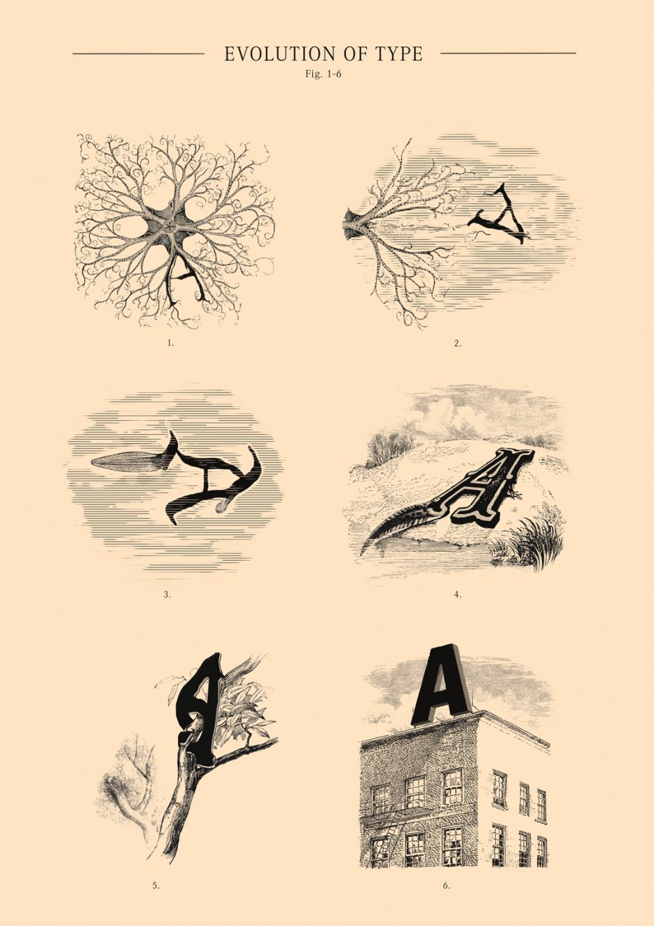
The lifecycles of typefaces are still a little mysterious, and continue to perplex investigators. While the internal anatomy of most fonts are similar to mammals and several of them go through a gestation period (see Figure 18), others reproduce through abiotic pollination by wind (see Figures 1-6). Suspended in specimen tanks, Scheiger has captured a number of plant-like letters in various stages of development. Most interesting is a letter A that appears to be floating on an imperceptible wind (see Exhibit 19). In its second phase of reproduction, the A has a fully developed feathery leaf that carries it in the breeze. In another encasement, Scheiger has encapsulated the stages of germination of a plant-like letter Y, from budding seed to full grown branches (see Exhibit 17). Scheiger has also made great strides to extend the lifespan of typography by resuscitating an A with the syllabised beating of a mechanical heart. By being the first to successfully transplant a 12-volt battery-operated motor, some pulleys and a push rod into its plywood casing, Scheiger has given the once-afflicted character a heartbeat like a cartoon in love.
Through his anthropological investigation of type, Scheiger has also uncovered the prehistoric remains of nine balsa wood letters that have been suspended in amber (see Exhibit 16/1-9). As digital printing threatens the extinction of movable type, it’s hoped that the preserved DNA of the letterpress letters can be used to clone future generations.

S is for Spine: Andreas Scheiger
appeared in CAROUSEL 31 (2013) — buy it here