From the Archive: Cole Closser ‘A Drip in the Mouth of a Horse’ Interview (CAROUSEL 39)
American cartoonist Cole Closser has been called a master of “butchered quotes and borrowed styles” — a man whose ink-stained dreams tend to have a yellowed, nostalgic residue covering them, and whose drawing style is constantly in a state of technical re-examination and flux.
Like the abstract expressionist painter Jackson Pollock — who is said to have noticed a drip in the mouth of a horse in Picasso’s mural-sized oil painting Guernica, and from that one peculiar observation created a whole new personal vocabulary — Closser’s ideas seems to instigate through acts of intense looking.
By studying the visual languages of iconic, bygone-era cartoonists such as Chester Gould, Harold Gray, Winsor McCay, E.C. Segar, and many, many others — as well as by noting how popular reproductions of their works have aged over time — Closser’s seemingly disparate, visceral vignettes appear to channel a new creative referent each time he moves forward. While doing so, he goes to great lengths to imitate old production techniques and artifacts of the press, brilliantly invoking & creatively mimicking different artists and time periods as he further develops his own narrative interests expressed through a number of unique book projects.
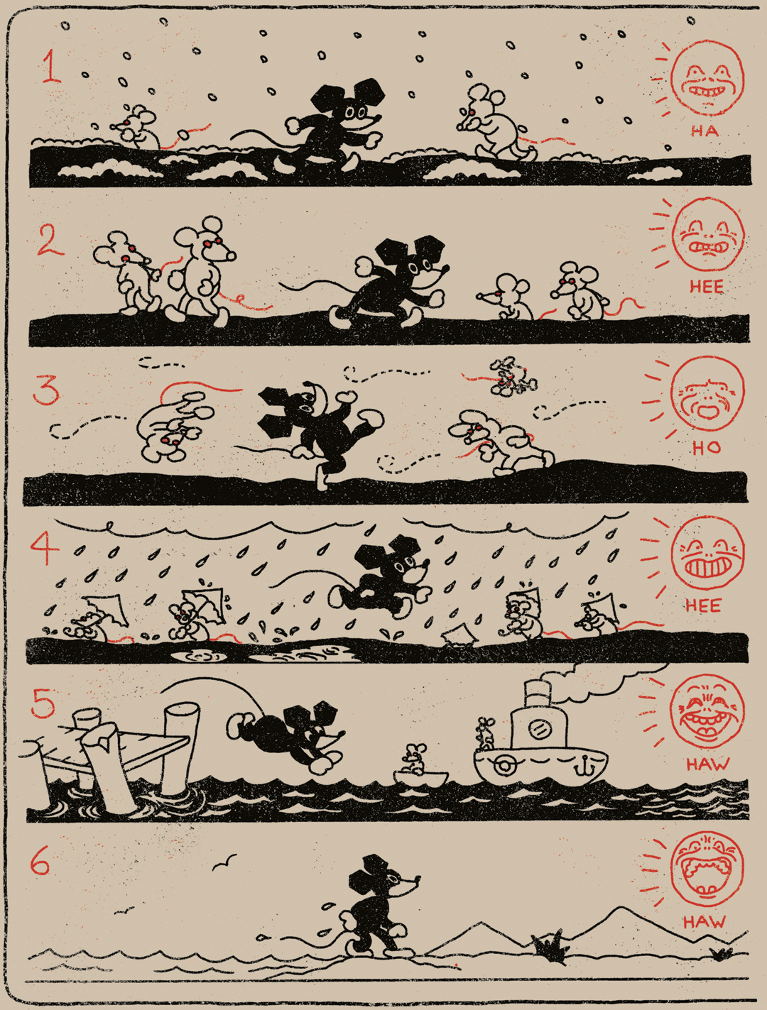
Closser’s most recent graphic novel, Black Rat (Koyama Press, 2015) is a schizophrenically illustrated collection of short stories revolving around one common character — the ever mysterious Black Rat — traveling through different time periods and cartoon worlds.
Interview conducted Fall 2017
Can you give us an idea of what initially motivates you to create a new work? I’m interested in how you match a style to a story, how you make the choices that will define the voice of a work.
I think I’m mostly motivated by just the desire to create. I have an urgent need to get things out of my head and onto paper, and I have this bizarre yearning to connect with someone a great distance from me — physically or in time — through my work. I’ve always felt compelled to create art and tell stories. I do go through periods of stagnation, but even in those periods, I continue to type stories into my computer and fill boxes with notes and sketches on scraps of paper.
As far as matching styles to stories, I don’t know: it’s a gut feeling, probably. I get interested in certain artists or time periods and then I obsessively study them, digging up as much work and information as I can on a person or a movement or a publication. From there, it’s just a matter of waiting for one of the stories in my head to match up with the imagery that’s haunting me.
Your projects seem to allow you to balance storytelling and formal experimentation; how important is it to play with form within a narrative?
It’s very important to me to play with form, I think — but never so self-consciously as to distract me from the narrative itself. The most important part of comics to me is the story. I want to connect with people; I want them to lose themselves for a little while in a world or a rhythm. I always feel cheated when I pick up a new comic from someone and it’s beautiful to look at, but there’s no story or attempt at emotional connection. There are only so many times I can look at a “cool” drawing, but I can read and reread a good or touching or horrifying story over and over again. I can’t stand irony for irony’s sake, which seems to be a trend in all parts of today’s youth culture. I value sincerity in the work I love, and I strive for it in the stories I write. That said, I do feel it’s important to keep pushing our medium through experimentation in order to show the rubes what comics are capable of.
When you borrow a style, do you also strive to make it your own? How do you know when you’ve taken ownership of the hand you are attempting to inhabit?
That’s a tough question. I guess it goes back to what I was saying about sincerity. I read a negative review of Little Tommy Lost once where the reviewer felt that it should have done something other than just tell a story in that setting. He wanted it to be a satire or to present something vulgar and edgy in the guise of an old newspaper strip. In other words, he didn’t understand anything about what I was doing — and is absolutely not the right audience for that book. I want to tell stories and share my thoughts through the medium I cherish over all others, sometimes using styles and methods that invoke nostalgia. I wear my influences on my sleeve.
I don’t know how I know when I’ve taken ownership of a hand. I don’t know that I ever do really take ownership. The Globe and Mail had a lovely review where they wrote that I was a “cartoon ventriloquist,” sticking my hand into old comic strips that don’t belong to me. I like that, but I think it might be the other way around. The work I love affects me deeply and it guides me sometimes, spilling down my arms and into my hands. Sometimes it feels like channeling to me. It brings me closer to these dead men and women whom I love, which all ties back into the “living forever” thing. I cried when I read about the suicide of Gus Dirks. I fell in love with Edwina Dumm. I mourn Walt McDougall almost every day. I hope to someday, long after I’m dead and forgotten by anyone who knew me, come to life for some other lonely lover of comics when they laugh or get weepy over some story of mine they find.
Are you a fan of Al Columbia and/or Robert Sikoryak? I’m thinking that these two very different artists are creatively aligned with your approach to comics — all of you seem grounded in a similar conversation with comics history.
I am a fan of both of those guys. I like Al Columbia’s drawings, but the subject matter isn’t always my thing. I grew up on reruns of Bosko cartoons and all of those other old Harman-Ising, Fleischer and Iwerks shorts. Columbia really nails that look. His Book of Revelation story he did for Blab blows my mind. So many people try to mimic that aesthetic (especially with flash animation), but they miss the entire feeling.
R. Sikoryak was a favourite of mine as a kid, especially his Inferno Joe strips (which reduces Dante’s Inferno to a series of Bazooka Joe gum-wrapper gags). All of those RAW guys were and are favourites of mine. I got to meet and work with Bob at the Center for Cartoon Studies. He’s a ridiculously nice guy. He and James Sturm were kind enough to ask me to edit a newspaper anthology with them before I’d done much of anything else — well, Little Tommy Lost: Book One was already finished, but I hadn’t published it with Koyama Press yet.
I definitely agree that those two and I share an interest in (and are in conversation with) comics history, but we all tackle very different elements in our work. Al Columbia seems to be a lunatic genius who wants to expose the horror in everything through the vehicle of innocence and nostalgia that early animation provides — the old-timey nature of the imagery seems as though it’s intended to primarily act against the subject matter. Bob Sikoryak uses old, familiar, lowbrow source material as a vehicle for satirizing classical literature and concepts. Both of them seem to use the medium of comics to very openly lampoon or lay bare ideas that wouldn’t typically be seen in “kid’s stuff.”
While I’m just as in love with old cartoon pictures, I’m trying to work within the medium in as sincere a way as possible. I have little interest in irony for my own work. I don’t want to satirize or horrify; I want to tell stories and connect. I don’t want to draw attention to the form; I want readers to lose themselves in the world, or the work. However, much like those two guys I look up to, I do have the lofty hope of exposing more readers to fine art and literary concepts in the often-frowned-upon-in-America medium of comics. Since reading RAW as a child, I’ve wanted to make comics that are the antithesis of pop art. Where pop art sought to place ordinary or lowbrow objects/subjects in the highbrow, precious, sometimes pretentious setting of the art gallery, comics (as a medium) is uniquely capable of taking high concepts and smuggling them into unsuspecting hands in the lowbrow, disposable wrappings of dimestore funny books.
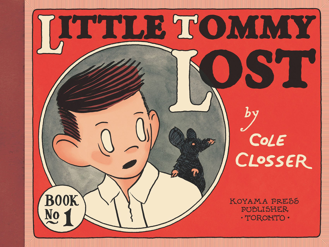
Let’s discuss your major works-to-date. Little Tommy Lost: Book One follows the adventures of a lost boy as he searches for his parents in a big city. Harold Gray’s Little Orphan Annie is a crucial touchstone, influencing your visual framework for the entire project. What about Gray’s Annie inspired you to make this book?
I started writing on Little Tommy Lost around eight years ago and I’d only worked on short works previously — one to eight pages. I was very much still new to the craft and searching for my voice. I’d been reading quite a bit of Harold Gray’s Little Orphan Annie and Roy Crane’s Wash Tubbs and Captain Easy, and I fell in love with the elements of a serialized, daily adventure comic strip. Roy Crane is probably the bigger influence on the strip as a whole: I tried to capture some of his rhythms and imagery specifically, and some of the poses in the book were straight-up lifted from my giant collection of NBM Wash Tubbs books.
With that said, I was reading a lot of Harold Gray when I decided to start the project — and what inspired me most was just the idea of doing one strip a day. I also thought it would be fun to play off of his famous two-fisted orphan with a heart of gold in the name and look of the strip. Gray was known to be a very conservative man politically, and Annie represented his conservative ideals of “pulling one’s self up by one’s bootstraps.” Where Gray is conservative, I’m as liberal as they come. Where Annie is a little girl with a white dog, Tommy’s a little boy with a black rat. Where Annie resets regularly and never suffers consequences for long, Tommy is affected by his choices and experiences permanently — and he ages over the course of the strip.
Structurally, the work celebrates the classic daily newspaper strip, a serial storytelling form that first came to life in the pages of newspapers in the 1910s. The rhythms of this form — a weekly cycle consisting of 6 b&w strips and then a full-colour, Sunday burst — provide a clear measure with which to pace each chapter in the book. Talk about working with this ‘narrative metronome’ and how it impacted your storytelling approach.
I loved working this way. The strip started as an exercise in seeing if I could just do one strip a day. I was posting each episode online as a daily webcomic for the first forty strips or so. I would write out the events I wanted to accomplish as far in advance as I could think of them, and then I’d do one or two finished strips each day to progress in that narrative.
Those old adventure serials from the 20s and 30s always recapped what had happened in the story so far right in the opening panel, then more action took place, then the final panel had some kind of cliffhanger or punchline. I strived for that same rhythm. I referenced Frank King’s Gasoline Alley for my Sunday strips when I realized that it worked better to keep the narrative confined to the dailies and to use the Sunday pages as an excuse to experiment a little.
The Tommy Lost strips are painstakingly distressed — you’ve yellowed the pages, which makes the entire collection look like an artifact. By aestheticizing comics pulp past, was it your intention to makes the work seem ‘unearthed’?
Yes, I wanted Little Tommy Lost to feel like a discovery from an estate sale that somebody liked enough to publish as a collection. Cartoonist Steve Bissette told me that his wife thought it really was a collection of old strips — and that’s about the highest compliment I could have hoped for.
I’ve loved old comics since I was a kid. I collect old clippings when I find good ones, and I’ve spent countless hours on sites like Barnacle Press over the years (a web archive of vintage comic strips). For me, the yellowing newsprint, the artifacts in the microfiche, the halftones — it’s all part of the experience. I scanned a different sheet of old newsprint for each strip in the book. I took period-appropriate digital newspaper scans, reversed them on top of each strip, and then faded them to appear as if they’re printed on the opposite side. I hand-distressed each individual strip. It was almost a religious ritual.
Book One ends precariously, with Tommy escaping the city in a shipping crate, heading out to the high seas. Are you intending to continue Little Tommy Lost?
Oh, Little Tommy Lost is far from over. This story will be four books eventually. The whole thing’s been plotted out for a very long time. The second book is halfway finished. I think of Little Tommy every now and then and start to panic that I left him the way I did; I just have a few other things I need to explore before I can get back to that story. I have too many projects I’d like to see finished.
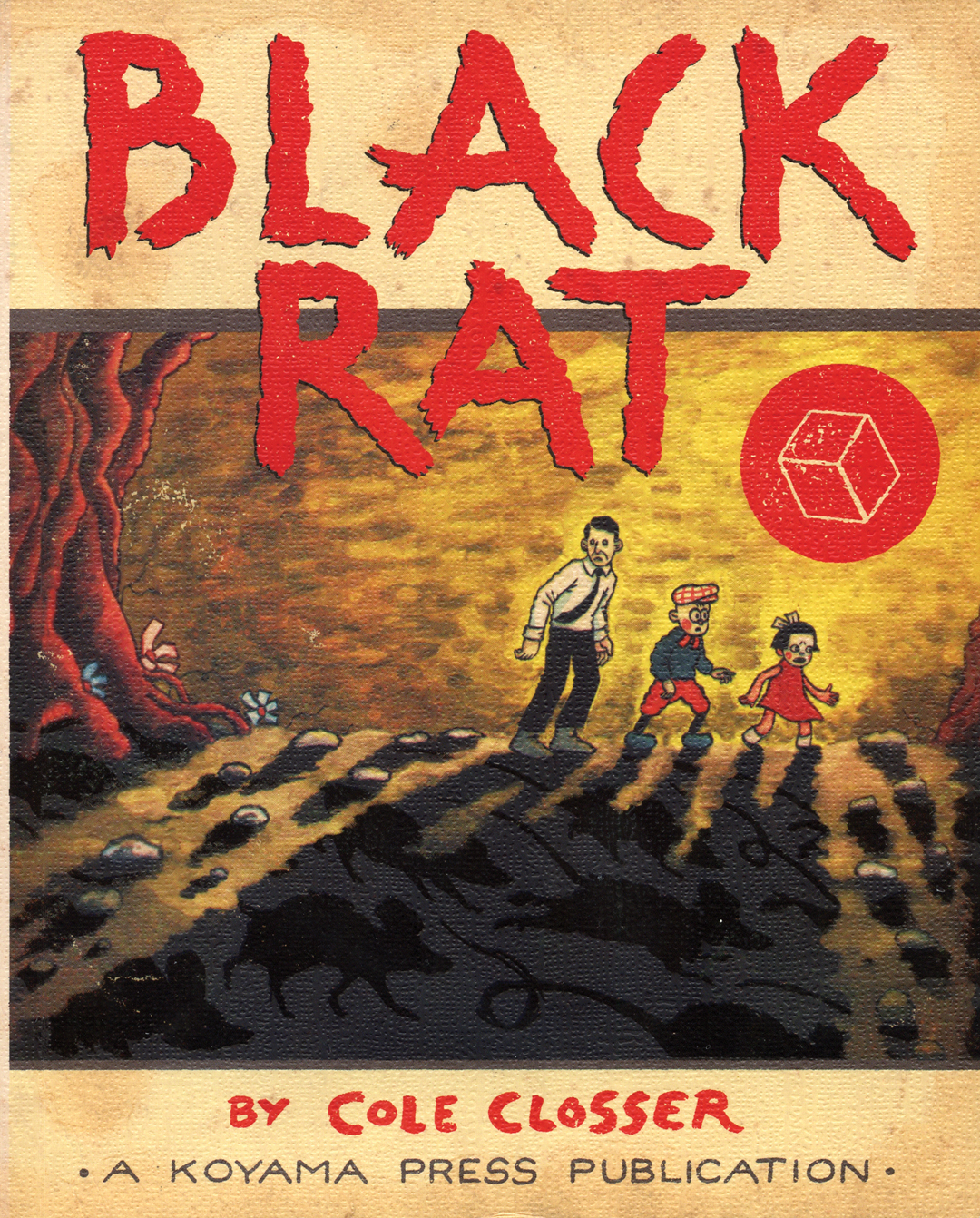
For your second release, Black Rat, you took a looser approach to storytelling. The Black Rat is a character that you build a series of nine short stories around, the skeleton key used to unlock all the tales in the book. How did you decide on this framework?
I’m not sure how I settled on the framework, really. The idea was in my mind from the beginning. I knew the rat and the cube would appear across the book. I wanted the titles to always be composed of two words: one with three letters, followed by one with five letters — to mirror the words ‘BLACK RAT’ in size on the page, creating a shape like an hour-glass. I planned for the length of the stories and the use of colour to be mirrored within the book as well.
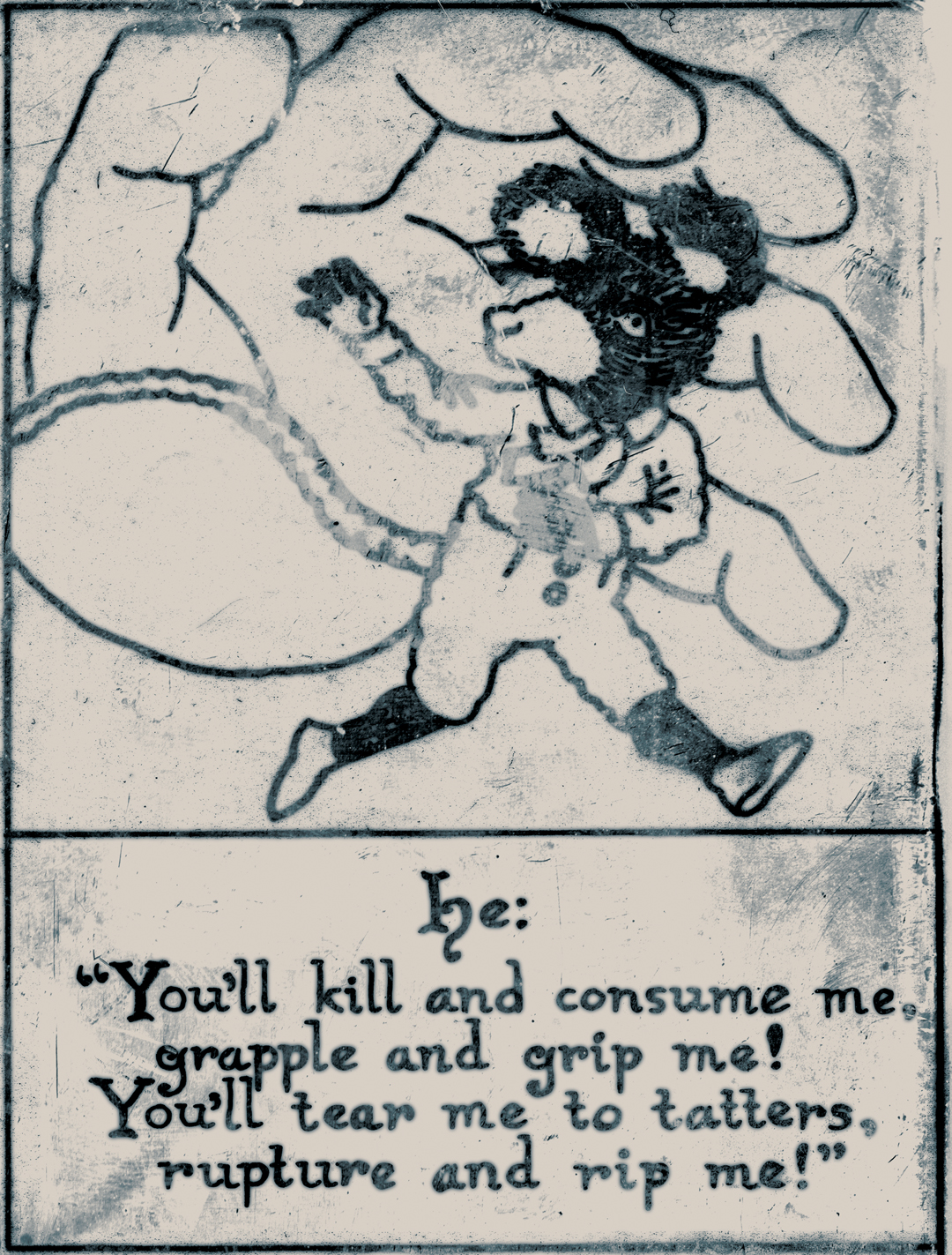
‘War World’ opens up the book: in it, your rat protagonist leads a man through a window/ portal on 3 trips into — and back out of — a violent cartoon world. It’s very cyclical, symbolic storytelling. The stream-of-consciousness ramblings found here, and throughout much of the book, make me wonder about your writing process. Did you script the stories beforehand, or work them out intuitively as you moved forward?
Every project I start has its own process. It’s important to me that each story I work on finds the form that best fits it. That first story in Black Rat, ‘War World’, was written and drawn in a weekend, I think — all at once; I may or may not have been drunk at the time.
The “stream-of-consciousness ramblings” were me trying to be as loose and authentic as possible with the writing, while spilling my guts. Black Rat represents who I am in ways that Tommy really can’t. I poured my heart and mind into those pages. I wanted the book to feel honest, spontaneous and sincere. Most people who tell me they’ve read it seem to connect with that.
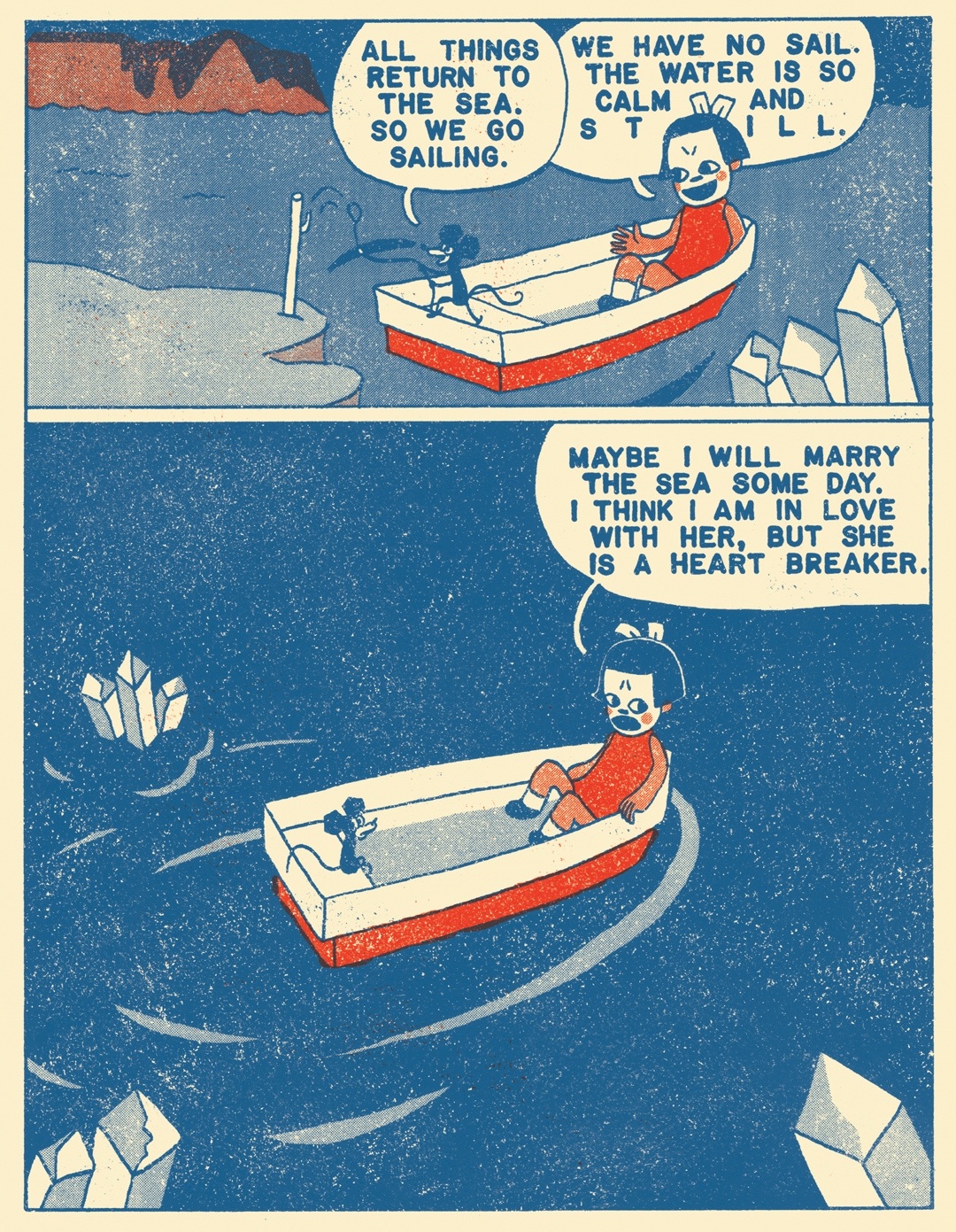
‘Boy Blanc’ and ‘Bow White’ were both written in thumbnails and notes. ‘Air Ships’, ‘Our Watch’, and ‘Now Sleep’ were written as prose first, with the imagery in my head. ‘Our Watch’, my favourite story in the book, had been in my mind for months before I finally wrote it down. I’d been struggling with the voice and the rhythm until I was asked to speak at a writer’s retreat in Missouri, and I listened in on one of the workshops: the instructor, Jen Murvin, practically preached to the group about refrain and point-of-view in the most inspiring way, and at the end of the session I’d written the first draft of what’s in the book. On a side note, Jen and I are now friends and we teach a course on comics together at Missouri State University.
Several stories in the book stylistically reference the work of pre-war Japanese manga artists like Suiho Tagawa (1899 – 1989) who created comics that emphasized the joyful kinetics of cartooning, with a colour palette distinctively lacking in blacks. These scrappy, often poorly-printed comics are hard to come across here in North America; how did you become aware of this period of manga?
I first saw Tagawa’s Norakuro in Kramer’s Ergot 6, and it blew my mind. It was like tasting roast beef or hearing Tom Waits for the first time. I couldn’t believe I’d made it 26 years without having seen it, because it struck me as exactly what I’d always wanted to see, but never known existed. I immediately hit eBay to track down copies of the old books for myself. The intro, outro, and author page of Black Rat are tributes to Tagawa; the title itself is a direct reference to Norakuro (Black Dog).
After seeing Norakuro, I scoured the Internet for everything I could find on old, mostly-forgotten manga, which is how I found Sanpei Yoshimoto and a number of other Japanese cartoonists. Dan Nadel’s Ganzfeld 5 from 2007 introduced me to the work of Shigeru Sugiera, and then Ryan Holmberg’s article on The Comics Journal site in 2012 on akahon manga was the last huge eye-opener to seal the deal for me.
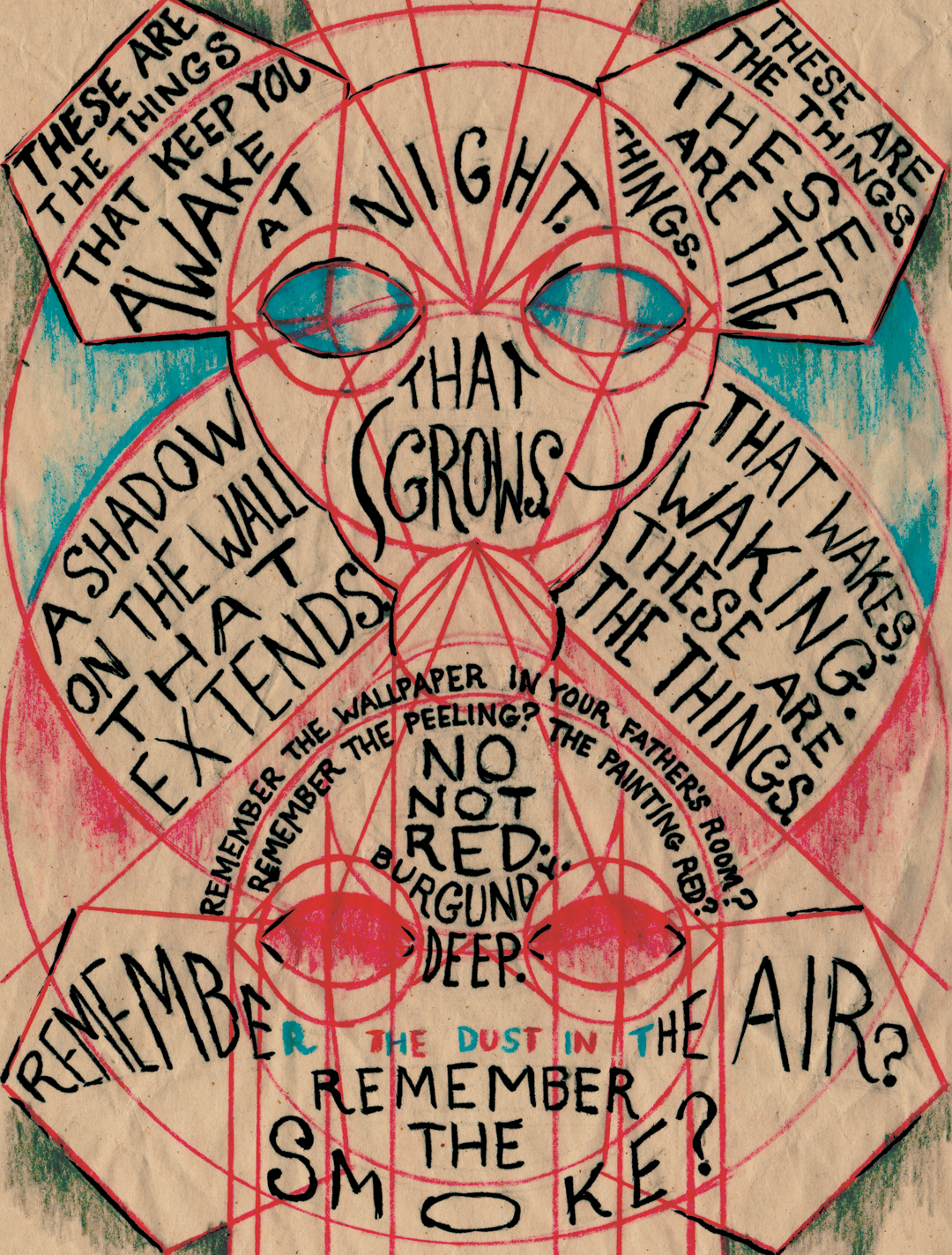
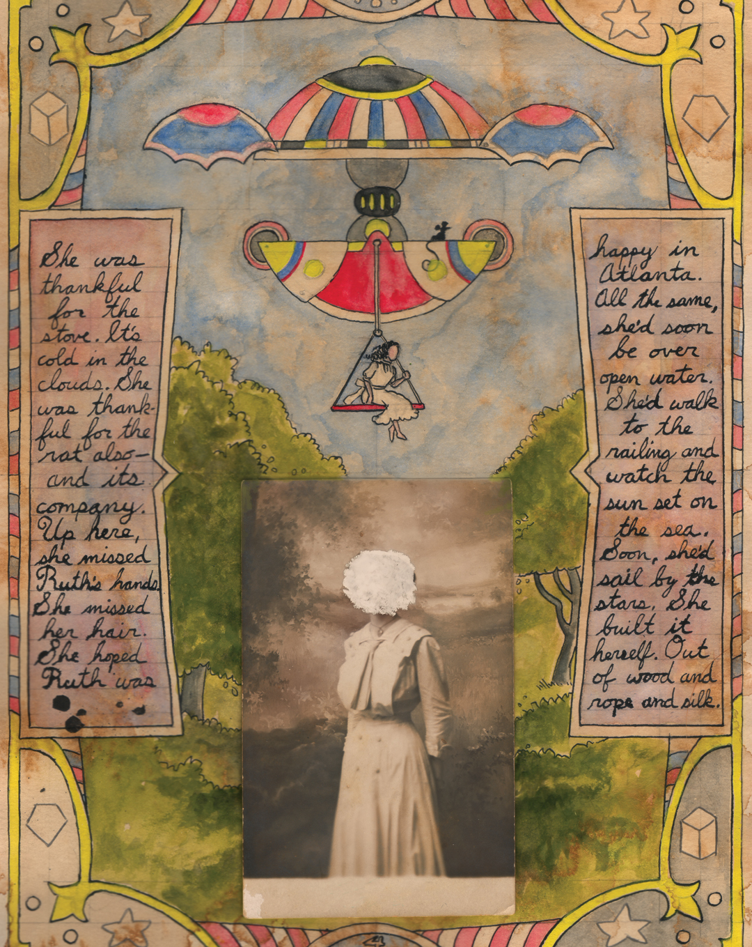
Other works in the book are indebted to the Outsider Art movement, and here you strive to recreate some deeply individualist art styles. With ‘Air Ships’, you do a great job of reanimating the storytelling techniques of Charles August Albert Dellschau (1830 – 1923), one of America’s earliest known Outsider artists. These are not necessarily creators associated with a comics tradition, but their sense of design and unique approaches to presenting narrative really do merge with some of the more auteur tendencies surfacing in the alt-comics world recently. What were you connecting to here?
Outsider art has resonated with me on a very deep level since I first saw Henry Darger in RAW when I was 11 — which I guess is what connects the outsiders to comics for me. I was obsessed with MTV’s Liquid Television in the 90s, too — which had a number of RAW artists on board, mixed with animators from all skill levels with the craziest stories and aesthetic choices. I’ve always liked the way rough, honest, strange, punk, outsider work makes me feel (it makes me feel really fuckin’ weird).
I’ve known plenty of other artists who can’t appreciate outsider art. I think it’s just one of those things that either grabs you or doesn’t. I’m obsessed with comics, texts, songs, or images that look/feel/ sound more raw than polished. I love it when it feels as though the soul of the artist is on display. King Terry’s work through Picturebox was the first place I read about the concept of Heta-Uma (‘Unskillful but Skillful’), and it really hit home for me. I’ll take a soulful, untrained, shaky scrawl over a pristine-but-dead technical triumph any day. That’s how I feel about mainstream comics most of the time. The lens flares and gradients, the glossy pages, the sterile and ill-fitting computer letters in vector balloons — it all smells like a hospital full of dead and dying dreams to me. I don’t like it. Give me Gary Panter, C.F., Rory Hayes and J. Bradley Johnson. I don’t care much about corporate intellectual properties or ‘realistic’ drawings. I just want to feel something when I’m interacting with art.
At an alchemical level, past its surface narrative underpinnings, Black Rat is also a great little critique aimed at the idea of ‘style’. It seems to me that now more than ever before, artists are rewarding for crystalizing their personal visual style as early as possible, and then sticking to it. How can that be fulfilling? What are your closing thoughts on this? You obviously look at things a little differently.
I have too many thoughts on the subject of style, so this might be a long one. Just as you say, young artists are constantly trying to find a look that will set them apart, rather than simply creating until they own their voice. They see their contemporaries standing out with a particular look and then they believe that they should have a look of their own too.
That’s not how it works. Your ‘style’ isn’t any choice you actively make in your work. It’s the part of your work that you have absolutely no control over. Your style comes through in your shortcomings; it is simply where you fail consistently. There’s a lot of space between your thoughts and the paper. In order to draw that perfect picture in your mind, you must filter it through your head, heart, arm, hand, and then translate it to the canvas through your limited understanding of the tool you’re using to draw it with. It’s like a one-person telephone game, and it’s in that loss of clarity that YOU as an artist show through. Picasso supposedly said that style is “the difference between a circle and how you draw a circle” — of course no one can ever draw a perfect circle, because their hands and hearts always get in the way, and that’s the point.
An artist should never try to develop a personal style; rather they should just keep working until a unifying aesthetic naturally happens over time in the work. If you intentionally develop a style early on in order to stand out, you’ll only have to break it apart later when that style is out of fashion. Modern artists, illustrators, cartoonists and musicians who ape the aesthetic choices of their contemporaries only set themselves up to appear dated and derivative later. When a style is ‘put on’ and sold as an artist’s real voice, it can strike the reader/viewer/listener as disingenuous and irritating — like a singer faking an accent.
This idea is always in my mind with the appropriations and homages in my own comics. I would never claim any one aesthetic approach as my own personal ‘style,’ but I do wear each of my influences plainly and proudly on my sleeve when I’m trying to channel a specific voice. Regardless, no matter how hard I try to imitate any dead idol of mine, my own voice and hand still show through in my inability to be exact — in the consistent inconsistencies in the work: an awkward stiffness in the figures or an uncomfortable wobble in the line that will never go away.
Since I play so much with imitation, people are regularly asking me what my favourite style to work in is — or what my ‘real style’ is. In terms of not directly referencing another creator, ‘Our Watch’ in Black Rat is probably the closest thing I’ve done to what the drawings in my sketchbooks actually look like. I also did a chapbook for Rotland Press a few years ago that adapted the Grimm tale Bearskin, which wasn’t referencing anyone in particular.
While I find it difficult to engage with the work of some newer, stylistically-focused cartoonists, there are still plenty of newer artists with distinctive voices whom I really dig. Olivier Schrauwen and David King are probably my favourites; they both reference old work, but make it their own. Each of them can draw better than just about anyone; they both consistently surprise me with their innovation and their voices. On the other end of that spectrum, Patrick Kyle and Michael DeForge don’t seem to be influenced by cartooning’s past, but mainly by each other in a Fort Thunder kind of way, and maybe by the zeitgeist of a post-Internet, post-Adventure Time generation. I find their aesthetic choices incredibly compelling and challenging, while always appearing genuine and inventive, rather than put-on. Plus, they’re just really nice guys.
I think the problem of being style-focused often comes from that basic misunderstanding of what style is; it isn’t an end goal for an artist to seek, but simply the consistent inconsistencies in an artist’s hand which help make their work recognizable, regardless of skill level. Those qualities and flaws are internal, and no matter what mask an artist chooses to wear, their hand will betray, expose, and reveal them in the end, which is beautiful. For me, the thrill is in the mistakes.

Cole Closser Interview
appears in CAROUSEL 39 (2017) — buy it here