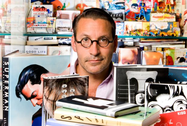
From the Archive: Chip Kidd ‘Gasp! You Did It!’ Interview (CAROUSEL 33)
Chip Kidd is a man of many talents, with an insider’s perspective on pop culture. Universally recognized as an American master of contemporary book design — USA Today once described him as “the closest thing to a rock star” in the graphic design world — his iconic covers offer an inventive marriage of type and found images. In addition, Kidd’s work as an editor of books of comics for the mass market have helped to elevate the artform in North America.
Interview conducted May, 2013
Looking into your history, we see that you are most famously a graphic designer; an occasional novelist; playfully, a musician —
Yes, very playfully …
— you have a background in school with that. Explain the impulse?
Growing up, I liked to draw. I decided I wanted to play the drums very early on because of Chris Partridge on The Partridge Family. I liked to sing in the choir — it’s a cliché, but I was into the arts and not into playing little league baseball and that kind of stuff.
When I got to high school, I stopped taking art classes because I didn’t really think there was anything that high school art classes could teach me that I couldn’t figure out on my own drawing after school at home. More importantly my high school had — and has to this day — a fully functioning television station in the school and I found out about that very quickly, and became a part of that. That was a real revelation to me; we had two faculty advisors and then it was all done by the students, they would run camera and they would direct and do all the other stuff. It was really great, and so I thought, “all right, this is what I want to do”. I have a very pragmatic side: I knew that I needed to make a living doing something, and I couldn’t see doing that with music. Television seemed really fun and interesting.
When I was a senior at college, already been accepted to Penn State, I started doing the title cards for the shows, and that sort of clicked. It was an interaction between art and lettering — basically it was graphic design but I didn’t know it was called graphic design yet. Very early on in my freshman year I had a guidance counsellor who said “they have a great graphic design program here and you should look into that”. That seemed to be a path to take that would be creative, but that you could make a career at. It’s not like I wanted to go into advertising, but I thought the way they taught graphic design there was really interesting: it was about problem-solving. It was visual but if you couldn’t draw very well that didn’t matter so much because you could hire somebody else to do that in the real world.
As a graphic designer with an enviable position at a major publisher for the past 26 years, could you tell us how you landed in this position, and if you realized what access you’d be getting to the public eye?
Pure luck, and not at all. I was really really naive, and very, very lucky. Right place, right time, with the right portfolio. It was the fall of ‘86, it was the cusp of pre-Mac, pre-Apple, so I’d learned everything by hand. I had a couple of givens: I wanted to be in New York City and I wanted to work I graphic design, other than that I had an open mind. I had a good friend who was able to put me up in Brooklyn until I found a job. That helped a lot. I would relentlessly go into the city everyday and pound the pavement and show people my portfolio. I really wanted to work for a design firm, and I saw many of them, and everybody had nice things to say but nobody had an entry-level job. Somebody pointed me towards Random House to get some freelance book jacket work, so I did that. They actual gave me a paperback book cover to do; it was a charming disaster but the art director of Knopf at the time saw my portfolio and called me in because she needed an assistant. Immediately I thought “yes, this is what I want”. That was a really big break; the salary was pathetic, but it worked for me at age 22 to live in Williamsburg. I thought “great, I have a foot in the door and we’ll see how this works out; I’ll give it a year.”
Within a year, all the staffing changed — it was just changing all the time. The woman who hired me got married to a Bostonian and reluctantly had to leave. We got a new editor-in-chief in who, without specifically saying so, wanted to see something different. That really helped.
So, it was luck, timing and persistence. I didn’t plan on becoming a book cover designer, but I kept an open mind. I had a vague idea of the books with the little dog on the spine, but I didn’t really know what Knopf was. Very early on my new boss explained what that meant in terms of status, and I quickly found that out. The other major factor that appealed to me right away was credit, getting credit for the work. Most graphic designers don’t; book designers do. At the time, album cover designers did. The accessibility of the back flap of a book to see who designed the cover was very important.
Until fairly recently, many graphic designers were backgrounders — only a handful have a significant name presence in the culture. ‘Chip Kidd’, however, is virtually a brand at this point. Was that a strategy?
Not at all, I make it up as I go along. I was able to work on some really good high-profile projects relatively early on and have my name attached to them. I was given the opportunity to do something different with the approach to book cover design: more use of photography to illustrate fiction, fluorescent colours, it all depended on the book. There’s been a steady stream of really interesting books that I’ve been able to design, and people paid attention to it. But it wasn’t any ‘strategy’ on my part; I’m actually the worst at that.
For a while the model was: pay your dues somewhere and then open up your own shop. I thought about that for a while, but decided — either out of laziness or inertia — that I didn’t want to that. I didn’t want to have a staff, I didn’t want to oversee a bunch of people, I didn’t want to sit in meetings … I wanted to design. So I kept my own personal freelance business as small as it can be; it’s just me and what I have time to do.
Things evolved from there. Writing the novels, forming a relationship with DC Comics, helping to restart the graphic novel publishing at Pantheon. And again, being lucky. When we started to do that, Chris Ware and Dan Clowes both had books that they wanted to publish, and they wanted to work with a new publisher. I was able to bring them to Pantheon, and that was huge.
As a graphic designer, you’ve noted that you prefer to have “a sensibility over a style”. Can you elaborate on that?
It’s hard to articulate it. I point to British graphic designer Peter Saville; he is by example a great proponent of this. All his Factory album covers looked great formally but they were all completely different, and yet there’s a kind of coolness and really interesting detachment to them. I kept noticing his work with album covers and I began to realize that this was the same person doing all these different things. That really appealed to me: to not have to be nailed down by any kind of specific visual approach to problem-solving.
One of the nicest things to hear is that “Oh, I saw this thing in a bookstore, and I really liked it. And then I saw that you did it, And I never would have guessed that you did that.” That’s the goal. I certainly don’t always reach that, but that’s the goal. To kind of start from scratch each time, and use your experience to try and break some new personal ground.
Looking back at your designs, particularly in relation to some of the projects that you’ve done around spotlighting comic book histories for a mainstream audience, you seem to have successfully aestheticized comics’ sloppy pulp past. Can you discuss the impulse to zoom in in that way and focus on the elegance of that past as a surface?
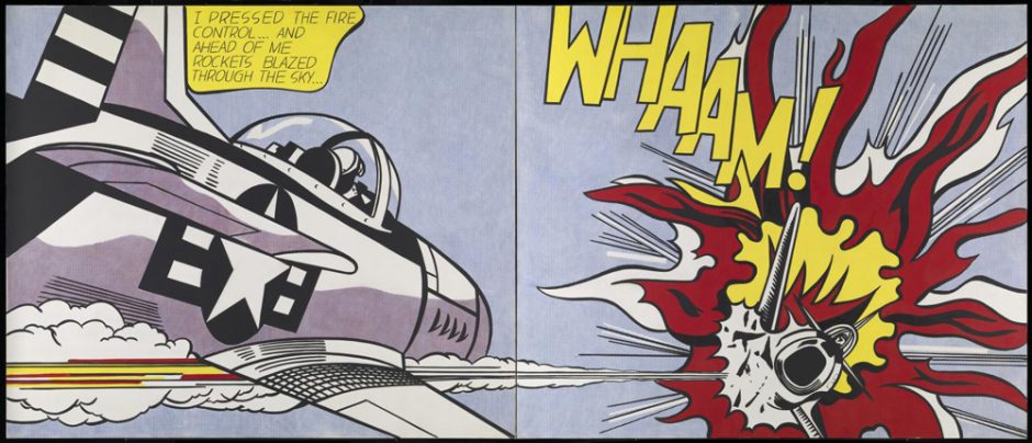
There is always this impulse that “if we’re going to reprint old stuff, let’s clean it up” — and I disagreed with that. Preserving the dots is just a very simple graphic design trick: if something looks interesting at size and you blow it up 600%, it’s going to look better. As much as I loathe him, this is what pop artist Roy Lichtenstein was exploiting for a long time.
The first projects where I was really able to explore that position in print was the 3 books I did with Les Daniels: Superman, Batman, Wonder Woman: The Complete History. Chronicle Books was the publisher but DC was overseeing it. With those three books, I explored preserving the dots, doing selective panels, highlighting things through blow ups.
After that, I got asked to do a book on Charles Schulz about six months after he died, and I was given access at that time to what archive there was. My decision aesthetically with it was to try to set it apart from all the other Peanuts books that have been done by showing either the strips as they appeared in papers or the original drawings. It runs the gamut of his career, but focuses on the first twenty years of his career.
The book Jack Cole and Plastic Man: Forms Stretched to Their Limits with Art Spiegelman, we shot from the comics and just left them as they were, we didn’t ever photoshop them to make them look sharper or to apply a different colour sensibility.
At that time, I kind of became known as the ‘dots guy’.
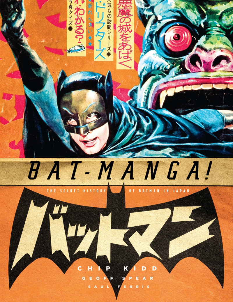
There’s an aesthetic you’re obviously drawn to, but it seems to me that through the way you handle the material, you must certainly be aware that conceptually there’s something going on there — you’re giving people that view behind the wizard’s curtain in a way. It seems to me that you’ve gravitated towards projects that allow you to go much deeper into that — I’m thinking of books like Bat-Manga!: The Secret History of Batman in Japan, or Watching the Watchmen: The Definitive Companion to the Ultimate Graphic Novel, which are essentially allowing you to dig into archives, slip behind the veil of product culture, unearth the rough notes, the sketches, the alternate versions. Can you talk about that, what it allows for you?
Bat-Manga! and Watching the Watchmen are actually two very different projects. Bat-Manga! is what I call a work of comics archeology. Discovering that all this wonderful stuff existed but went out of print immediately. And then trying to rescue it, make it available, make it known.
Watching the Watchmen was literally about artist Dave Gibbons asking me to do it. The legend with that is that he sold all the artwork but kept all the prep stuff, I guess he thought who would want the prep stuff. As things progressed and the Watchmen phenomenon grew, he realized that people might want to see it. It is about seeing the process, exploring Alan Moore’s directions. It also reveals how much Dave brought to it. It was really eye-opening to see just how much thought and detail went into it.
What worked best about The Watchmen as a series were the kind of intense conversations that the writer and artist and the editorial team had to actively push the medium and take it to the next level. By extension, this same kind of attitude is reflected in your Watching the Watchmen project; it’s actually one of my favourite books that you’ve been involved in. For me that kind of rich behind-the-scenes journey you’ve sequenced feels like the best kind of DVD extras on a movie — the Criterion Collection approach, where you get really in-depth research, a well executed look at things. How do you know how much energy to put into a project?
If I remember correctly, I was reluctant to take it on because I knew it would be a major commitment. When I do one of the massive projects, I like to have a lot of control, and I prefer to do the whole thing myself. With the Watching the Watchmen book, I knew that was not going to be possible. I said I needed to bring somebody else on, and that’s the only way it was going to work. Mike Essel who was a friend and a fan — he’s the head of graphic design at Cooper Union in NY — he was willing and available to help. He was familiar with the way I approach these things, and did most of the heavy lifting on that. We helped structure it. The experience starts the instance you open the cover and see the endpapers: their not just decorative, they mean something. I love doing visual overtures in the beginnings of these books that go on for ten, twenty pages. We analyzed the order that you meet each of the characters in the first issue of the comic, and then we put in visual representation of all of them to sequence; it was a start that felt correct but not obvious. And we took it from there. Dave was very supportive of our approach to the book.
Are there any projects-in-progess that are maybe 5 years in that we may eventually see?
I probably shouldn’t talk about it, because I don’t know if it’s ever going to happen, but I would love to do Super-Manga!
That exists?
It does — and that’s the first thing that everybody asks. Yes, it does, and it would be a really cool book.
Do you feel that your skill set as a writer influences how you approach your work as a graphic designer, particularly on these larger books? I’ve heard you refer to a book cover as “a distillation — a haiku of the story”; it’s a poetic way of viewing the challenge.
I think that learning how to write helped me become a better designer or at least a better thinker by helping me you have to force yourself to figure out how to articulate something. How do you say something? My cliché is writing is designing with words.
In a very practical way, it helped me relate to authors better. Authors can become very nervous — which I understood better once I was doing my own book. You work on this thing for a long time, and I couldn’t imagine giving it over to somebody else to figure out how it was going to look. And that’s what most authors do; there are very few prose authors who also design their own books.
The language that graphic designers work with is a distinct one — a mass language. Comics share that language. Seth, by example, is an incredible designer, and it really impacts his ability to tell a story. It also draws attention to his sensibility. Can you give me a sense of how you see graphic design and comics merging, with examples of really exceptional directions?
Chris Ware is the obvious choice here. He really creates this incredible confluence of graphic design and comic book storytelling. As a brilliant self-taught designer, he’s clearly influenced a lot of people and sort of changed the game. Dan Clowes, Charles Burns, David Mazzuccelli are all great designers; a lot of these guys really incorporate design into their work as a way to guide you through the story and relate the narrative. It’s very effective.
Have you noticed how beautifully packaged everything is starting to be within the comics industry? Even within the alternative market, well-designed hardcover books are becoming the norm. This is happening at a time when the ‘death of print’ is a kind of buzz statement hovering over us all, it’s something that we hear about all the time in the media. Is this a believable concept? I’d like to hear it from someone who is working at the top of the industry. And if this is the case, are comics an exception?
Again, I’m like the worst person at predicting anything. What we’ve seen is that material that people want to read and keep will keep print alive. Material that people want to read and discard are the things in jeopardy. I’ve been lucky: I work at Knopf. What does that mean? It means mostly what I’m designing are first editions of literature. They are by their very existence archival: you feel strange throwing a hardcover book away. You maybe give it to someone, donate it, but you don’t put it in the trash.
With comics, especially with all the various formats, their whole raison d’être is as a ‘thing’. Certainly web comics are a phenomenon and people like them, but I don’t see it challenging the print market. Print is evolving, but it’s always evolving.
What do you think of zine culture, handmade books, the micro-end of the print spectrum — the exact opposite of the high-end push to hardcover. Does that interest you?
I think there is far more material to take in and consider than I have time to do. I think being able to take control of your work is very important, but it’s also very important that you know what you’re doing. It’s good to see people taking risks. I love to see all the things that people are doing on their own in small editions. It’s not really what I do; most of what I work on or publish is quote “mass-produced”.
How then do you negotiate risk in a mass market environment — how do you take chances?
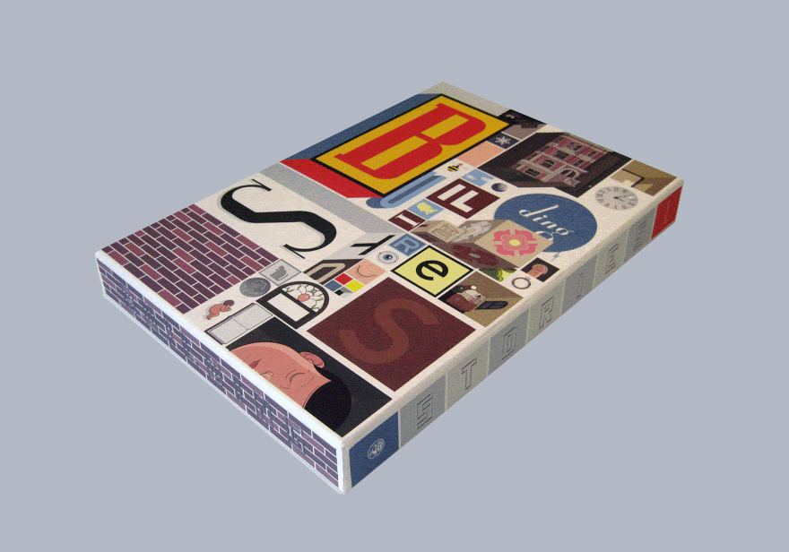
Publishers get nervous about being able to sell enough copies of high-run books, so there are plenty of opportunities to take chances. For example, with Building Stories, the fact that Chris Ware’s name is not on the front of the package took a lot of convincing our sales force and marketing people that it was going to be fine. We’re talking about this giant box with 14 things in it, with a first printing of 50,000 copies. I did not think it was taking a risk, but there were a lot of people who did. It paid off; the reviews were great. I think that was considered strange, a risky thing to do.
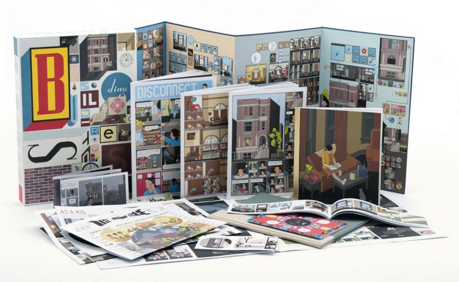
The Building Stories book is very interesting because it sort of feels like it captures the experience of being at a small press fair — on one hand, it’s all Chris Ware’s work and there is a narrative going on; but physically, structurally, if you put it all out on a table, it’s a lot like a small press display …
I hadn’t thought about that — you’re absolutely right; you’d have to ask him if that was part of his intention. I wish I could claim more credit for it than I can. Technically I was the editor, but really what that means is just kind of being an ambassador on the project between Chris and my colleagues at Random House and Pantheon. There are certain duties I undertake: I have to write the fact sheet, I have to run the profit and loss statement. If someone on the sales force has a question about it, they call me. If I have to present it in a meeting, people need to get it. I didn’t really have much to do with it creatively; I wouldn’t even say I was an art director here, Chris does all that.
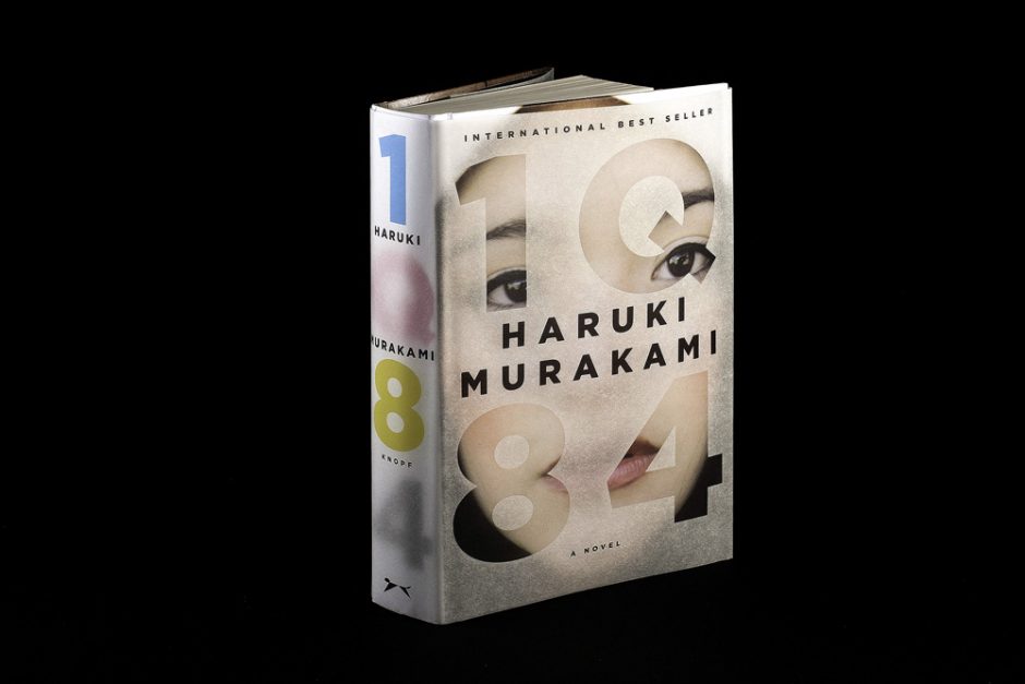
You did a TED Talk, “Designing books is no laughing matter. OK, it is.” — it’s a very popular talk. Towards the end of your talk, you pitch for print, and the love of physicality. Have you had a sense that there’s been an impact, that you’ve become an ambassador for that cause?
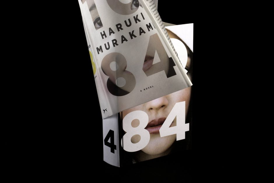
I’ve gotten a lot of really great feedback on it, but other than that I have no idea. The timing was good because I had a tangible thing in Haruki Murakami’s 1Q84, where I could sort of prove that the print version did extremely well because it was perceived as an object you wanted to have because of the way it was constructed. In terms of the numbers we did extremely well with the print version as opposed to the e-book version; I was able to quantify that in the talk.
Back to something you hinted at earlier: why do you loathe Roy Lichtenstein?
I just hate the idea that a comics panel by Irv Novick is critically given no credit but when Roy Lichtenstein made a painting of it (Whaam!, 1963), it got elevated to the status of real art. The idea that the appropriated thing is the real thing and that the comic book was just fodder to make it is dreadful. The same thing goes for Warhol: whoever designed the Campbell’s soup can label should get as much credit and compensation as Andy Warhol did for copying it. I have a real issue with that.
I feel that you’re describing an older sensibility — the conditions of the time made it possible for Lichtenstein to exploit a ‘lower’ art form that people in cultural positions of power were ignoring. Today, culture isn’t as linear as it used to be in terms of ‘high’ and ‘low’ polarities; we appreciate minor histories in a way that they couldn’t in the ‘60s. Do you still think there are ‘high’ and ‘low’ barriers, that these zones are competing in the culture?
I think they definitely compete in the culture. The fine art world continues to baffle me and it will for as long as there is breath in my lungs. It’s all about what people value, or are talked in to valuing. It’s personal. I would rather have original comic book art on my walls — which I do — than a Matisse.
It was, however, an honour to accompany Chris Ware to the 2002 Whitney Biennial. There a real barrier was broken — here’s a comic artist who doesn’t claim to be anyone else, getting this entry into the world of the Whitney. I think a lot of people resented it.
Crumb has certainly gotten the same access.
Yes.
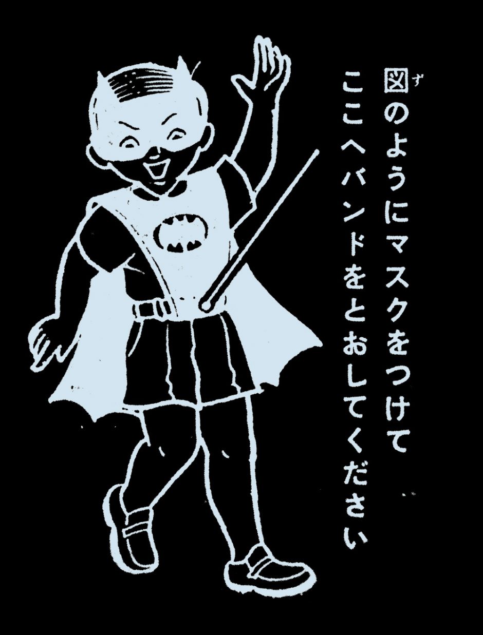
Yet some of the book projects you undertake could be classified as dominant cultural declarations — Chip Kidd elevating something less known, or revealing a minor history to a larger, more generalized audience. The Bat-Manga! project is certainly about unearthing something that occurred in a ‘low’ bubble and reauthoring it for the masses, isn’t it?
When I work with this kind of material, I’m not trying to present it as anything other that it is. With Bat-Manga! for example, you have this fascinating confluence of east and west, so relatively soon after World War II — and that’s what makes it interesting. In collecting this work and telling its story, I’m not not trying to transform it into “real art”, or repackage it as my work. It’s about letting people know it exists.
When I was working on the book back in 2005, doing a Google search in English on Jiro Kuwata would pretty much get you nowhere — and almost nothing would come up in relation to Batman. That literally was not there; we couldn’t find anything that verified that he did Batman comics. A project like the Bat-Manga! book changes that.
Do you think graphic design and the visual art world are in conflict?
I have to hand it to people like Barbara Kruger and Lawrence Weiner for making the leap. I think the work is great to look at, and it gets taken seriously. Good for them — but it’s graphic design. When people are doing both and get accepted for both, I think it’s great.
Do you have any desire to work in the white cube?
We’ll see.
Gasp! You Did It!: Chip Kidd
appeared in CAROUSEL 33 (2014) — buy it here